Coca-Cola is the world’s largest beverage company, and as one of its best-selling beverages, Coca-Cola has spawned many different flavors. Such as coco cola – light, coca cola- zero. And the image below shows that coca cola can use similar layout design for their different flavor cola.

Figure 1
The toilet sign is one of the most common signs in our daily life. And the toilet signs below, we can see these in almost any public place. The male sign and female sign used similar shape to create the consistency between these two signs.
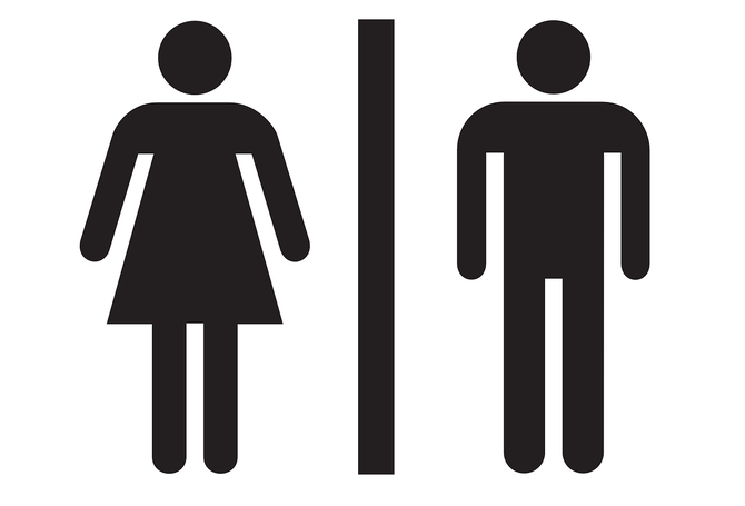
Figure 2
Direction sign is one of the most common sign we can see on the road or highway. They all use the same colour and similar shape to create the consistency and make driver easily knows that this sign is to remind people where this road leads to.

Figure 3
References:
Figure 1: Coca-Cola — Brand consistency on Behance. Retrieved from https://www.behance.net/gallery/11196997/Coca-Cola-Brand-consistency
Figure 2: Vinyl Toilet Signs (9 Designs) | Viro Display UK. Retrieved from https://www.virodisplay.co.uk/products/vinyl-male-female-toilet-sign
Figure 3: driving instruction direction signs – multiple.GIF. Retrieved from https://www.mainroads.wa.gov.au/BuildingRoads/StandardsTechnical/RoadandTrafficEngineering/TrafficManagement/DirectionalSignsGuidelines/Pages/Guidelines_for_Direction_Signs_in_the_Perth_Metropolitan_Area.aspx
